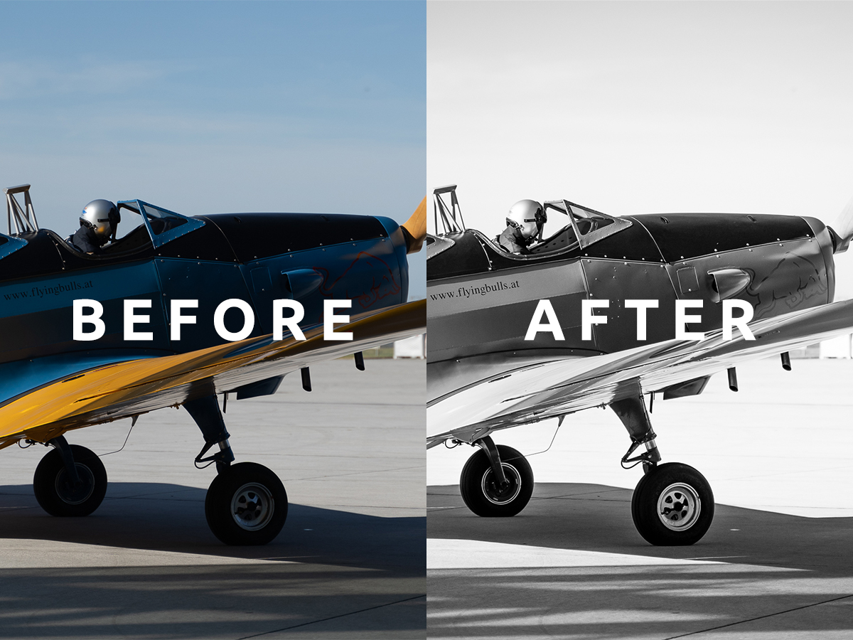
I photographed this Fairchild PT-19 at Hangar-7 in Salzburg, home of the Flying Bulls fleet. The aircraft were not all indoors that day: this one was out on the apron in hard daylight, crewed, with a plain blue sky behind it. The file was sharp and detailed, but I did not like the way its colours competed. The aeroplane’s shape deserved more attention than the paint scheme around it.
Black and white gave me a cleaner answer. By removing hue, I could work with the PT-19 as a structure: the narrow nose, the two open cockpits, the long low wing, the fixed landing gear and the hard shadow it threw across the concrete. The conversion was not about making an old aircraft look artificially old. It was about simplifying the frame.
The comparison at the top of this article is a detail from that frame — the cockpits, the engine cowling and the wing root. The complete before and after files appear further down.
Camera settings for the Fairchild PT-19 photograph
| Setting | Recorded value |
|---|---|
| Camera | Sony a7 III |
| Lens | Tamron 28–75mm f/2.8 |
| Focal length | 75mm |
| Aperture | f/2.8 |
| Shutter speed | 1/3200 s |
| ISO | 125 |
| Location | Hangar-7, Salzburg, Austria |
| Final treatment | Black and white in Adobe Lightroom |
These are the settings recorded with the original article, not a recipe for every aircraft photograph. The 75mm focal length narrowed the view and kept the apron clutter down to a floodlight mast and a distant white marquee. The f/2.8 aperture separated the aircraft from the background, although at that distance it also made focus placement matter.
What 1/3200 s did and did not buy me
A very fast shutter speed is easy to criticise on a subject sitting on the ground. In bright sun at f/2.8 and ISO 125, though, it is close to the exposure the scene demanded — opening the lens that far in that light leaves little else to give.
It also had a visible cost. The propeller is frozen solid, every blade edge clean. That is a stylistic choice as much as a technical one: much of aviation photography deliberately runs a far slower shutter and pans, so a turning propeller blurs into a disc and the aircraft reads as alive rather than parked. Frozen blades can make a running engine look stopped.
Here that hardly matters, because the aircraft was stationary and the photograph is about form. But it is the honest trade-off to name, and it is the first thing I would change if the aircraft had been moving.
Watch the black-and-white Lightroom edit
This was my second YouTube editing video, following my first Lightroom tutorial. The recording shows the 2023 session; the principles below remain useful even if the interface and masking tools have changed.
Before and after
Before

The colour version carries more immediate information, but that information is not equally useful. The blue paint, the yellow leading edge, the red logo and the pale concrete all pull the eye in different directions, and the yellow wins every time. The aircraft’s actual shape comes second to its advertising.
There is a second, quieter subject the colour version buries: two people. A pilot in a white helmet sits in the rear cockpit, and a second person occupies the front one. The shutter speed freezes the propeller completely, so the still frame cannot tell us whether the engine was turning.
After
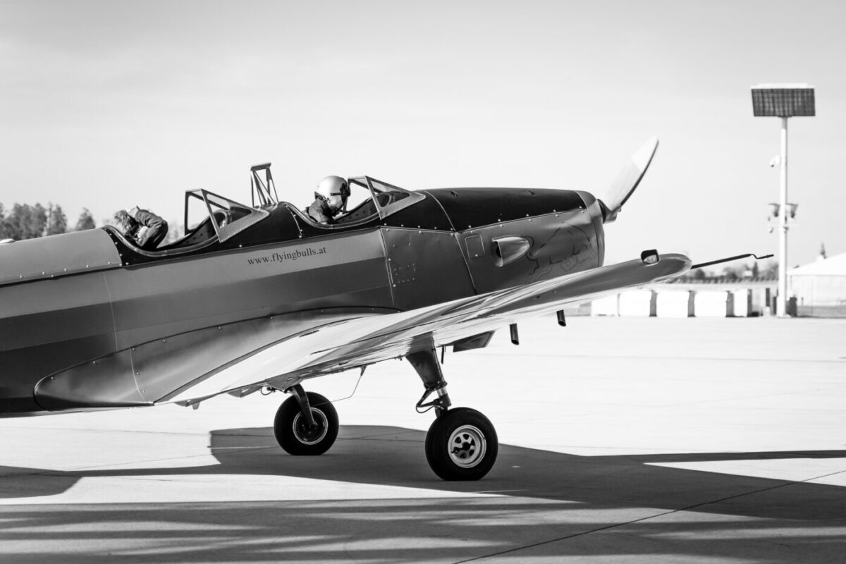
In the monochrome version, the viewer reads brightness, texture and line first. Two changes do most of the work. The sky is lightened until it is nearly blank, which turns the aircraft into a silhouette problem instead of a colour problem. And the yellow leading edge is lifted rather than darkened, so it survives the conversion as a bright diagonal running from the wingtip into the fuselage.
The shadow on the concrete gains as well. In colour it was a grey area on grey ground; in monochrome it becomes a second, angular shape anchoring the aircraft to the apron.
Why black and white suited this aircraft photograph
Converting a file to monochrome is not automatically an improvement. Colour can describe materials, era, identity and light. I chose black and white here because the original colour did not organise the scene; it scattered attention.
Three qualities made the conversion useful.
The PT-19 has a clear silhouette
The Fairchild PT-19 was designed as a primary trainer, with a low monoplane wing, fixed landing gear and a narrow inline-engine nose. Those forms remain recognisable without colour. A subject that depends on coloured markings for identification might need a different treatment.
The livery was competing with the aeroplane
A Flying Bulls scheme is designed to be seen from a distance at an airshow, not to sit quietly inside a photograph. Blue against yellow against red against a blue sky is a lot of colour for one frame. Removing hue did not remove the design — it converted it into tone, where the yellow could become a deliberate bright line rather than the loudest voice.
The background gave me almost nothing
An empty blue sky, pale concrete, a floodlight mast and a distant marquee are not a rich environment. In colour that emptiness reads as a slightly dull day. In monochrome the same emptiness becomes useful negative space, and the sky can be pushed almost to white without anyone missing what was there.
A note on the aircraft’s history
Fairchild developed the PT-19 in 1938, and quantity production began in 1940. More than 7,000 examples of the series were produced for pilot training. The Flying Bulls list their aircraft as built in 1943. Black and white can acknowledge that history, but I did not add fake film scratches, sepia or damage. The aeroplane is a restored, flying object in contemporary use, and the edit should not pretend otherwise.
My black-and-white Lightroom workflow
1. Correct the colour file first
Even when the final image will be monochrome, I check exposure, lens correction, crop and white balance first. White balance affects how colours map into grey during conversion, so it is not irrelevant.
I also inspect highlights on reflective surfaces. Once a metal or painted area clips to pure white, monochrome cannot recover its texture. On a polished aircraft in direct sun, that risk is real.
2. Convert using the black-and-white controls
The simple Saturation slider removes colour, but Lightroom’s black-and-white mode provides a mixer that controls how original colour ranges translate into grey. That is the central tool.
This photograph is a clear demonstration of why. Blue fuselage and yellow wing could easily have converted into two similar mid-greys, and the aircraft would have gone flat. Pushing yellow lighter and blue darker rebuilt the separation that the colours had been providing.
The same blue channel also controls the sky, so the two decisions fight each other: darkening blue for the fuselage darkens the sky as well. That is the kind of conflict a mixer forces you to resolve deliberately rather than by accident.
I move channels gradually and watch for halos, noise and unnatural patches.
3. Establish black and white points
I use Whites and Blacks to give the image a full tonal range while preserving important detail. Pure black can anchor tyres, cockpit openings or structural shadows. Pure white can exist in small reflections. Neither should swallow the surfaces that describe the aircraft.
The histogram helps identify clipping, but the photograph decides whether clipping is harmful. A tiny point of light can be white; a broad wing surface usually needs tone.
4. Shape midtone contrast
Most of the aircraft exists in the midtones. A gentle Tone Curve can make metal, fabric, glass and painted surfaces separate. Clarity and Texture can add local definition, but high values make edges brittle and create halos where a dark aeroplane meets a bright sky.
I prefer to add structure to the aircraft locally rather than forcing the same contrast onto the whole frame.
5. Darken distractions selectively
A monochrome conversion can make previously quiet background areas unexpectedly bright. A local mask can reduce exposure or highlights there. I use broad, soft transitions and avoid drawing a visible vignette around the aircraft.
The floodlight mast on the right is the obvious candidate. It is a hard vertical in an otherwise horizontal composition, and once the sky lightens it becomes more noticeable, not less.
6. Check noise and sharpening
At ISO 125, noise was not the main problem, but monochrome contrast can make fine texture more visible. I sharpen meaningful edges and use masking to avoid sharpening smooth areas. If I add grain for aesthetic reasons, I treat it as a visible creative effect — not as proof that the photo came from film.
A practical monochrome checklist
| Check | What I look for |
|---|---|
| Silhouette | Does the subject remain clear without colour? |
| Tonal separation | Have two different colours collapsed into the same grey? |
| Reflective highlights | Is texture preserved on bright painted and metal surfaces? |
| Deep shadows | Do cockpit and landing-gear details survive? |
| B&W mixer | Do channel changes create halos or patchy sky? |
| Background | Does emptiness work as negative space or just as absence? |
| Authenticity | Does the edit avoid fake ageing unless clearly intentional? |
| Output | Does the image still work at normal web or print size? |
Common mistakes in black-and-white aircraft editing
Removing colour without rebuilding contrast
A flat desaturation often produces a flat photograph. Different colours can collapse into nearly identical grey. The mixer and tone curve restore separation deliberately.
Crushing the cockpit and tyres
Dark areas create weight, but they still contain form. If the cockpit becomes one empty patch, the aircraft loses depth — and on this frame it would also lose the two people sitting in it.
Overusing Clarity
Aircraft contain many hard edges and reflective materials. Excessive Clarity creates halos and makes polished surfaces look dirty or brittle.
Adding a historical cliché
An old aeroplane does not automatically require sepia, scratches or heavy grain. Monochrome can be contemporary and clean.
Forgetting the capture settings
Editing cannot create depth of field that was not recorded, and it cannot restore propeller movement that a fast shutter removed. At f/2.8 and 75mm, focus placement matters. Those decisions belong to the moment of capture, not to Lightroom.
The Fairchild PT-19 in brief
The PT-19 was a primary trainer developed by Fairchild for military pilot instruction. Its low-wing monoplane arrangement and narrow nose gave students experience closer to later operational aircraft than older biplane trainers could provide. Production began in 1940 and expanded through Fairchild and other manufacturers.
The example associated with the Flying Bulls is listed as a 1943 aircraft. I photographed it from the ground as a visitor, not in flight. That context shapes the image: the challenge was not tracking an aeroplane through the sky, but making a stationary machine on a flat grey apron look like something worth looking at. Black and white is how I got there.