I photographed Plečnik’s Market in Ljubljana on 30 November 2019 with a Sony a7 III. It was a cold day, and the original file already contained the visual contrast that interested me: blue winter light around the exterior and warmer artificial light inside the market structure.
My Lightroom edit did not try to make the whole scene comfortable and warm. I wanted the outside to stay cold. I then made the interior warmer and more orange-red, so the architecture became a boundary between two temperatures. The familiar blue–orange relationship was not pasted onto the photograph; it was developed from light that was already there.
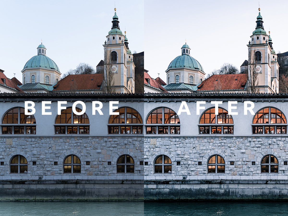
The comparison at the top of this article is a detail from the frame — the cathedral dome and bell tower, Ljubljana Castle on its hill and three of the arches. The complete before and after files appear further down.
What I changed
| Area | Direction | Purpose |
|---|---|---|
| Interior light | Warmer, further toward orange-red | Create visual shelter and separation |
| The river | Stronger, greener teal | Carry the cool half of the contrast |
| Stone façade | Brighter, blue cast removed | Stop the wall competing with the water for coolness |
| Roof tiles | Deeper red | Connect the rooftops to the warm family |
| Overall contrast | More deliberate | Give the arcade and openings clearer structure |
| Highlights | Controlled | Keep the lit windows from becoming empty white patches |
| Colour saturation | Restrained by region | Avoid turning the entire frame into a blue–orange effect |
It is worth being precise about which parts actually became cooler, because the shorthand “cool outside, warm inside” hides the real decision. The stone wall did not go bluer — it went lighter and cleaner, losing the flat blue-grey cast it had in the original. The cold side of the photograph is carried by the Ljubljanica and by the shadowed recesses, while the warmth is concentrated in the windows and, more quietly, in the roof tiles above.
This was a mood edit, but it still depended on believable relationships. Stone under overcast winter light does not have to be perfectly neutral. A warm interior does not need to become bright orange. The two sides only need enough separation to make the temperature contrast visible.
Watch the Lightroom edit
The video preserves the original 2023 editing session. The written explanation below focuses on decisions that remain useful even when Lightroom’s interface changes.
Before and after
Before
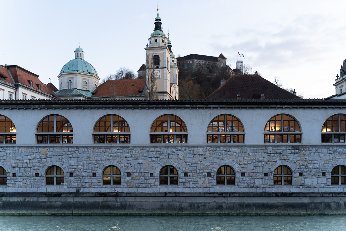
The original contains a relatively restrained difference between the cool environment and the lit interior. Its strength is that the information is present: detail in the structure, colour in the lights and enough tonal range to decide how much the two zones should separate.
Behind the market halls the frame gathers most of the postcard version of Ljubljana without being arranged for it: the green copper dome and clock tower of St Nicholas’s Cathedral, red tile roofs and the castle on its wooded hill with the flag flying. Bare trees date the picture to late autumn as clearly as any caption.
After
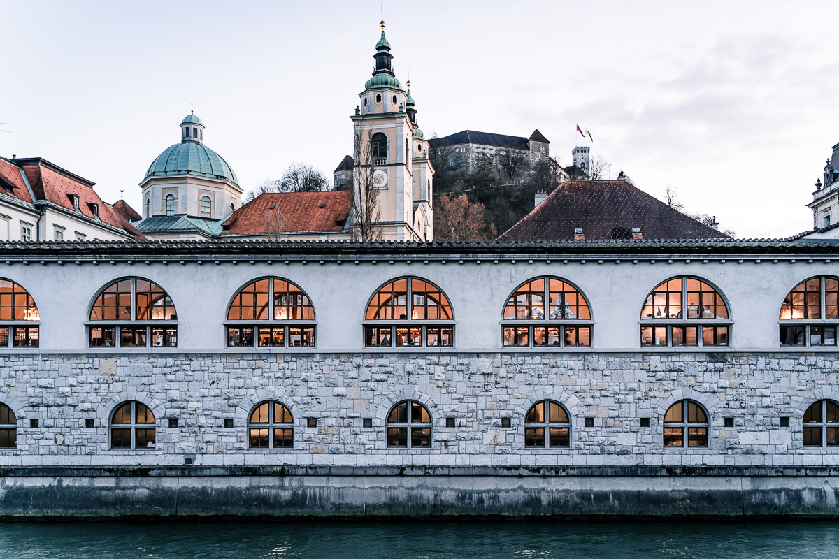
The final file makes the same scene read more quickly. The exterior belongs to winter; the interior offers a line of warmer colour. Neither zone needs to dominate every part of the frame.
A brief note on Plečnik’s Market
Plečnik’s Covered Market is part of Ljubljana’s Central Market along the Ljubljanica. Jože Plečnik designed the two-storey riverside market halls, which were built between 1940 and 1944. Their rhythm of columns, openings and curved riverside alignment makes the structure practical and highly photographic at the same time.
The market belongs to the wider group of Plečnik’s works through which he reshaped public space in Ljubljana. UNESCO inscribed The works of Jože Plečnik in Ljubljana – Human Centred Urban Design on the World Heritage List in 2021. The recognition concerns a connected urban vision — markets, bridges, promenades, public institutions and other interventions — not only one picturesque façade.
For this photograph, the architecture matters because it divides and repeats light. The openings become a sequence of warm rectangles, while the exterior wall and surroundings hold the colder ambient colour.
How I build a cool-exterior, warm-interior edit
1. Establish a neutral reference without neutralising the mood
I begin by checking white balance on the entire RAW file. The goal is to understand the cast, not necessarily remove it. A winter exterior photographed under overcast light often feels blue. Warm lamps inside can move strongly toward yellow or orange.
If I make the stone perfectly neutral at the start, the interior warmth may disappear. If I set white balance from the lamps, the exterior can become excessively blue. I choose a global balance that keeps both zones workable, then refine them locally.
2. Correct exposure before colour grading
Colour becomes difficult to judge when highlights are clipped or shadows are crushed. I set overall exposure, recover important highlights and decide how much shadow information the scene needs.
Artificial lights do not need visible detail in the bulb itself, but the illuminated architecture around them should retain tone. Opening every dark area can destroy the feeling of evening or shelter. I want viewers to understand the space, not see equal detail everywhere.
3. Separate the two lighting zones
Lightroom masks are useful when one global white balance cannot serve the whole frame. A broad linear gradient, brush or luminance range can treat the exterior differently from the interior. Newer subject and object selections may help, but architectural openings often still need inspection and manual refinement.
For the exterior, I can move Temperature slightly cooler or use blue in Color Grading shadows. For the interior, I can add warmth, refine orange/red hues and raise exposure carefully. I avoid creating a visible boundary where the mask ends.
In this frame the two zones are unusually easy to separate, because Plečnik supplied the mask himself. The row of arched windows is a repeating band of warm light with hard architectural edges, and the wall between them stays cold. That is why the effect survives without looking painted on.
4. Refine orange rather than merely adding saturation
Warm artificial light can turn yellow, green or muddy depending on the source and camera white balance. The Color Mixer helps move yellow toward orange or orange toward red, then adjust luminance so the result feels like light rather than painted colour.
Saturation alone often makes illuminated surfaces look radioactive. Hue and luminance matter just as much. A slightly darker, controlled orange can feel warmer than a bright, fully saturated one.
5. Keep blue out of everything
The exterior needs coolness, not a uniform blue wash. Stone, sky, water and shadow respond differently. I check neutral objects and transition areas. If every grey surface becomes cobalt, I reduce the global effect and target the cooler zone more carefully.
That is precisely why the wall in the finished version is lighter rather than bluer. Letting the river hold the cold left the stone free to be stone.
6. Use contrast to describe the structure
Plečnik’s market hall gives the image a natural rhythm. Contrast can clarify columns, arches and openings, but excessive Clarity or Dehaze produces halos and hard edges around lights. I prefer a modest tone curve and targeted local adjustments.
The deepest darks provide repetition between illuminated sections. I let some areas remain dark, while protecting texture where it helps viewers understand the architecture.
Practical Lightroom sequence
- Apply lens correction and inspect perspective.
- Crop and straighten, keeping the architectural rhythm intact.
- Set a global white balance that preserves room for both cool and warm zones.
- Adjust Exposure, Highlights, Shadows, Whites and Blacks.
- Create broad masks for exterior ambient light and interior artificial light if needed.
- Refine yellow, orange and blue with the Color Mixer rather than raising global saturation.
- Check bright openings for clipping and dark architecture for unnecessary blocked shadows.
- Inspect mask transitions at 100%.
- Compare the image at normal viewing size and reduce any effect that announces itself before the subject.
- Export in sRGB and at the dimensions required by the website or final destination.
Why blue and orange work — and when they fail
Blue and orange sit broadly opposite one another on the colour wheel, so they create strong separation. Cinema and advertising use the pairing frequently because cool environments and warm skin or light can remain distinct.
That popularity is also the danger. If every shadow is forced blue and every highlight orange, unrelated photographs begin to look like the same preset. The pairing works here because the scene already contained cold outdoor light and warm interior light on a winter day.
I look for three warning signs:
- neutral surfaces lose all neutral variation;
- warm areas become uniformly orange, regardless of material;
- blue shadows appear where the original light does not support them.
When that happens, I reduce the grade or restrict it with masks.
Common mistakes in winter architecture edits
Bleaching stone to pure white
Surfaces reflect their environment. A cold cast can be part of the actual light. Removing it entirely may remove the season along with it — and a wall that has been pushed to paper-white loses the texture that makes masonry readable.
Brightening the interior too much
A warm interior draws attention partly because it is surrounded by darker, cooler space. If it becomes as bright as daylight, the relationship weakens.
Overcorrecting verticals
Geometry tools can improve an accidental lean, but heavy correction stretches corners and may crop away important context. I preserve believable perspective from the camera position.
Applying one preset to both light sources
Mixed light is the subject of this photograph. A single global treatment often compromises both zones. Selective editing is slower but more convincing.
Final thoughts
This Plečnik’s Market photo edit is built around a real contrast I felt on the day: winter cold outside and pockets of warmth within the architecture. The Lightroom work made that contrast clearer without changing the subject.
The most useful lesson is not “make shadows blue and highlights orange.” It is to look for competing kinds of light already present in a scene, decide which relationship carries the mood and edit each zone with enough restraint that the photograph still feels observed rather than manufactured.
If you want to see the same thinking applied to a very different subject, my Metelkova graffiti edit works the opposite way round: there the warm and cool families both belonged to paint on a wall rather than to two kinds of light.