At a concert, the stage rarely gives me a clean background. There are cables, stands, other musicians, LED panels and lamps aimed in every direction. When I photographed the lead singer of the Slovenian band Čuki with my Sony A7 III and Sony 50mm f/1.8, two bright stage lights behind him became pale blue circles. His face and microphone remained clear; the clutter stopped describing equipment and began describing the atmosphere of the performance.
That change is the reason photographers care about bokeh.

I photographed the lead singer of Čuki with a Sony A7 III and Sony 50mm f/1.8. The lights are obvious examples of bokeh, but the softer transitions across the rest of the background matter just as much.
I used to speak about bokeh as if it were another name for a blurred background. That is a useful shortcut when starting out, but it is not quite correct. A photograph can have a very blurry background and unpleasant bokeh. It can also have only a modest amount of blur, rendered so gently that the subject separates without looking cut out.
The distinction changed the way I photograph. I still use a wide aperture—sometimes too readily—but I now pay at least as much attention to the background, the distance behind my subject and the point that must remain sharp. Bokeh is not the subject of the photograph. It is part of the way the rest of the frame supports that subject.
What bokeh actually means
Bokeh is the visual character of the out-of-focus areas in a photograph. The word comes from the Japanese boke, broadly meaning blur or haze. The spelling “bokeh” was popularised in English-language photography in 1997, when editor and photographer Mike Johnston added the final h to steer readers towards a two-syllable pronunciation: roughly boh-keh.
The important word in the definition is character. Bokeh describes how a lens renders blur: whether transitions look smooth or nervous, whether highlights have soft centres or bright outlines, and whether repeated lines dissolve calmly or split into distracting patterns.
Three related ideas are often treated as one:
| Term | What it describes | The practical question |
|---|---|---|
| Depth of field | The range in front of and behind the focus distance that appears acceptably sharp | How much of my subject will be in focus? |
| Background or foreground blur | How far an area lies outside that range and how large its blur becomes | How strongly will the subject separate? |
| Bokeh | The appearance and transition quality of those out-of-focus areas | Does the blur look calm, busy, rounded, edged or distracting? |
A wide aperture can reduce depth of field and create more visible blur. It cannot guarantee beautiful bokeh, because the lens design and the background still have something to say.
Bokeh is not limited to circles of light
Small lights and reflections make bokeh easy to see because every out-of-focus point expands into a visible disc. That is why Christmas lights, street lamps and sunlight on water appear in so many demonstrations.
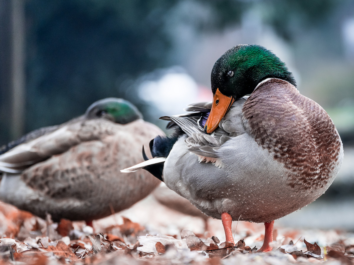
But bokeh exists across the entire out-of-focus image. Leaves, hair, lettering, railings and patches of colour all reveal how the lens moves from sharp detail into blur. A background without a single light circle can still have beautiful bokeh.

Point light sources make the shape of the blur easy to inspect. They are a diagnostic tool as much as a visual effect.
How an out-of-focus point becomes a shape
When I focus a lens, light from one distance converges on the camera sensor as a sharp point. Light from a different distance converges before or after the sensor. At the sensor plane it is no longer a point but a small patch, often called a circle of confusion.
If that patch is small enough, I still perceive it as sharp. Once it grows, I see blur. Its outline resembles the effective opening through the lens, which is why aperture blades influence the shape of defocused highlights.
Near the centre of the frame, a wide-open lens may render highlights as circles. Towards the corners, the lens barrel can partially obstruct the light cone, turning those circles into ovals commonly called cat’s-eye bokeh. Stop the lens down and the geometric shape of the aperture blades may become more visible.
None of this means that rounder is automatically better. A polygon can suit a night photograph, and a vintage lens with swirls or bright-edged discs can give an image a deliberate character. “Good” bokeh is partly a technical judgement and partly a decision about whether that character belongs in the frame.
The four controls that matter most
When I want more background separation, I do not begin by shopping for another lens. I look at four variables already in front of me.
| Control | Move towards more blur | What can go wrong |
|---|---|---|
| Aperture | Use a lower f-number | Too little of the subject remains sharp |
| Camera-to-subject distance | Move closer to the subject | Perspective changes; focus becomes less forgiving |
| Subject-to-background distance | Move the subject farther from the background | The location may not allow it |
| Focal length and framing | Use a longer focal length and reframe deliberately | Working distance grows and context disappears |
The third control—background distance—is often the most useful and the least expensive. Moving a person two metres away from a hedge can improve a portrait more than opening the lens from f/2.8 to f/1.8 while leaving the person against the leaves.
1. Aperture changes depth of field
A low f-number such as f/1.8 or f/2.8 means a wider aperture. At the same focal length, focus distance, sensor format and final viewing conditions, that produces a shallower depth of field than f/5.6 or f/8.
My Sony 50mm f/1.8 makes it easy to isolate one face. That does not mean I must use it at f/1.8. If a person is turned slightly away, one eye may be sharp while the other is already soft. With two people, the nearest face can be clear and the second one unusable. I stop down until the important parts of the subject fit inside the depth of field.
Aperture is a creative decision before it is a badge printed on the lens barrel.
For a fuller explanation of f-numbers and exposure, see my guide to aperture in photography.
2. Distance shapes the result before the lens does
Moving closer to the subject reduces depth of field. Increasing the distance between the subject and background makes that background fall farther outside focus. Used together, these changes can produce strong optical blur even with a modest lens.
This is why a flower photographed from close range can sit against a smooth field of colour, while a standing portrait made at the same aperture may retain much more background detail.
There is an important compositional cost. When I move closer, I change perspective and may distort a face with a wide lens. When I move the subject, I change the relationship between the person and the location. I do not use distance only to chase blur; I use it to decide how much of the place the photograph should explain.
3. Focal length changes framing and the background’s presence
Longer focal lengths often appear to create stronger background blur. In practice, several things change at once: angle of view narrows, the background appears larger in the frame, working distance changes and the physical aperture may be larger.
The approximate diameter of the entrance pupil is the focal length divided by the f-number. This does not predict an entire photograph, but it helps explain why the f-number alone is not enough.
| Lens setting | Approximate entrance-pupil diameter |
|---|---|
| 50mm at f/1.8 | 27.8 mm |
| 75mm at f/2.8 | 26.8 mm |
| 85mm at f/1.8 | 47.2 mm |
| 200mm at f/2.8 | 71.4 mm |
My 50mm f/1.8 and the long end of my Tamron 28–75mm f/2.8 therefore have similarly sized entrance pupils at their widest apertures. They do not make identical photographs. At 75mm I use a different camera position for the same portrait framing, include less of the surroundings and make the background appear larger. The resulting separation can feel stronger even when a simple specification comparison suggests otherwise.
The cleanest comparison is made with the same subject size in the final frame, not from the same tripod position.
4. Sensor size affects the choices around the image
It is common to say that a larger sensor creates more bokeh. The useful version is more precise: for the same framing and f-number, a larger sensor usually leads me to use a longer focal length or a closer camera position, which produces shallower depth of field.
The sensor does not decide whether the blur is smooth or nervous. That character still belongs mainly to the lens, aperture and scene. A full-frame camera makes shallow focus easier to achieve for a given composition; it does not automatically make the bokeh more attractive.
Smaller-sensor cameras and phones can still produce natural optical blur at close distances. What they find difficult is the classic head-and-shoulders portrait with substantial working distance and a broad background, which is why phones often recreate the effect computationally.
What makes bokeh look smooth—or distracting
I judge bokeh in two places. First, I look at obvious highlight discs. Then I ignore them and look at the transition behind hair, shoulders, branches and lettering. The second view is usually more important.
| What I see | Likely cause | How it affects the photograph |
|---|---|---|
| Soft, even discs | Gentle lens correction and a suitable background | Highlights recede instead of calling attention to themselves |
| Bright rings around discs | Optical design and spherical-aberration behaviour | Repeated highlights can look busy or “soapy” |
| Polygonal highlights | Aperture-blade shape when stopped down | Can look graphic or mechanical |
| Cat’s-eye shapes near corners | Optical vignetting | Can frame the centre or become distracting |
| Concentric “onion rings” | Marks associated with some aspherical elements | Most visible in large, bright bokeh balls |
| Doubled lines and nervous texture | Lens rendering combined with detailed background | Competes with hair, faces and fine subjects |
| Green or magenta fringes | Longitudinal chromatic aberration | Gives out-of-focus edges a coloured outline |
| Swirling background | Lens design, field curvature and vignetting | Creates motion and character, but can overpower the subject |
Aperture blades influence shape, not the whole quality
More rounded aperture blades can keep highlights circular as I stop down. Manufacturers often point to nine or eleven blades when describing a portrait lens, and the effect is real. It is not the whole story.
A lens with many blades can still render harsh transitions. A lens with fewer blades can make beautiful photographs when the background has broad tones instead of pin lights. I treat blade count as one clue, not a verdict.
Optical correction affects foreground and background differently
Lens designers balance aberrations rather than eliminating every one without consequence. Spherical-aberration correction can influence whether a blur disc is brighter in the centre or around its edge. It can also mean that foreground blur and background blur do not have the same character.
This is one reason a lens review built around a single row of fairy lights tells me less than it appears to. I want to see faces, foliage, fabric and a gradual focus transition at the distances where I will actually work.
The background remains part of the composition
Even the finest lens cannot turn every background into silence. Thin branches against a bright sky, railings, small high-contrast lettering and sunlit leaves can stay restless when blurred. A simple wall can look dead if it has no tonal variation at all.
Before taking the photograph, I move my head a little to either side and watch what happens behind the subject. A step can place a bright spot away from an eye, hide a pole behind a shoulder or replace a tangle of branches with open shade. This small change often matters more than the next lens upgrade.
How I create bokeh in practice
I do not have a “bokeh setting.” I build the effect from the scene outward.
Step 1: I choose the background before the aperture
I look for distance, broad colour, repeated light or texture that will still make sense when softened. At night, shop lights, traffic and reflections can become useful shapes. In daylight, shaded foliage, distant architecture or a field can give the subject a quieter setting.
The background should not contain a bright object that seems to grow out of a person’s head. Blur makes such mistakes softer, not invisible.
Step 2: I place the subject away from it
If I can control the scene, I avoid putting the subject directly against a wall, hedge or fence. Several metres of separation gives the lens room to transform detail into tone.
When I cannot move the subject, I change my angle. Photographing along the length of a street or room creates more distance behind the subject than shooting straight towards the nearest wall.
Step 3: I begin in aperture priority
For changing light, I normally start with aperture priority—A on Sony and Nikon, Av on Canon—and set the aperture I need. Auto ISO can absorb smaller changes, but I still watch the shutter speed. A beautifully blurred background does not save a face blurred by subject movement.
My starting points are deliberately conservative:
| Situation | Aperture starting point | What I protect |
|---|---|---|
| One-person portrait | f/1.8–f/2.8 | The nearest eye and enough facial depth |
| Two people on one plane | f/2.8–f/4 | Both pairs of eyes |
| Small group | f/4–f/8 | Everyone who must be sharp |
| Close-up flower or object | f/2.8–f/5.6 | The defining plane of the subject |
| Macro subject | f/5.6–f/11 | Enough detail despite extremely shallow close-focus depth |
| Night portrait with lights | f/1.8–f/2.8 | Shutter speed, accurate focus and highlight clipping |
| Environmental portrait | f/2.8–f/5.6 | Recognisable context around the person |
These are starting points, not promises. Subject distance and format can make f/4 look shallow in one frame and expansive in another.
Step 4: I focus on what the viewer will inspect
For a portrait, that is usually the nearest eye. Eye autofocus helps, but I check the result rather than trusting the green box. For an object, I focus on the edge or detail that explains its form. For a flower, the centre or nearest petal may matter more than the stem.
At very shallow depth of field, recomposing after focus can shift the focus plane enough to matter. I move the focus point across the frame or use eye detection instead of focusing in the centre and swinging the camera.
Step 5: I make more than one version
If the subject will wait, I take one frame wide open and another stopped down by one or two stops. The wide-open version may have more impressive blur; the stopped-down version often has a stronger subject. I decide on the larger screen, where a soft second eye or a distracting highlight is easier to see.
A ten-minute test that teaches more than a lens list
I can learn the useful character of a lens at home with one person or object, a string of lights and a background with some fine detail.
- Place the subject at least two or three metres in front of the background.
- Put the camera on aperture priority and keep the subject the same size in the frame.
- Photograph the widest aperture, then f/2.8, f/4 and f/5.6.
- Move the subject closer to the background and repeat.
- If using a zoom, make a wide and long version with matched subject framing.
- Add a small light or reflection near a corner of the frame.
- Inspect the sharp plane, the focus transition and the corners—not only the largest light circle.
This separates the decisions that are normally tangled together. I see how much aperture matters, how quickly background distance changes the frame, and whether the long end of a zoom improves the result enough to justify the extra working distance.
Reading bokeh in my existing photographs
The photographs from the earlier version of this guide already show several different uses of out-of-focus areas. They are more helpful when treated as examples rather than decoration.
The concert: light becomes atmosphere
In the concert photograph at the beginning, the blue stage lights form bright discs. The darker background between them is equally important: it leaves space around the singer’s profile and microphone. If every lamp had been placed directly behind his face, a wide aperture would have amplified the problem.
The image also shows why I use my 50mm f/1.8 in low light. The wide maximum aperture gives me both subject separation and more light for a usable shutter speed. Those are separate benefits, even though they arrive through the same opening.
The cherry blossom: shape and transition

The round highlights attract attention first. The quieter tonal transition behind the petals is what keeps the branch legible.
The blossom sits against a background with little recognisable detail. Large pale discs give the empty area structure. If their edges were brighter and harder, they would compete with the petals; here, the shared palette helps them stay in the same visual world.
The portrait: blur cannot repair placement

Distance has turned city lights into colour and rhythm, but their position still matters around the subject.
In a portrait, I look for the outline around the hair and shoulders. A bright bokeh ball that touches the cheek can be more distracting than a recognisable building farther away. Subject separation is not merely the absence of detail; it is the arrangement of the detail that remains.
The landscape: foreground blur can provide a point of entry
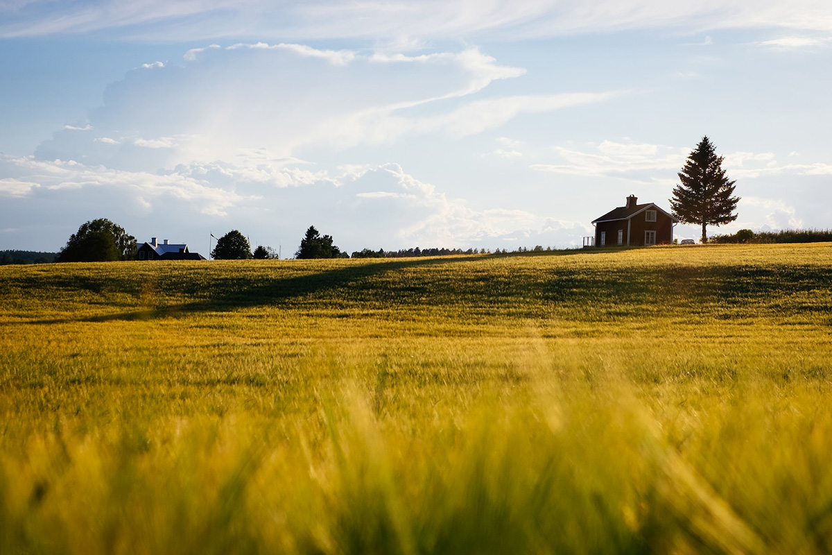
Bokeh is not reserved for portrait backgrounds. Here, the nearby grass is outside focus while the distant building and tree remain clear.
Landscape photography does not always require front-to-back sharpness. A blurred foreground can place the viewer low in the grass and give the frame depth. It works when the soft area leads towards the subject. If it covers the subject or occupies the frame without structure, it becomes an obstruction rather than an entrance.
When I do not want maximum bokeh
The lowest f-number is easy to mistake for the most professional choice. Sometimes it is simply the easiest way to lose information.
When the setting explains the subject
An environmental portrait should tell me where a person works, lives or performs. If I turn every tool, sign and architectural detail into colourless haze, I may remove the story along with the clutter.
I still separate the subject, but I stop down until the background becomes readable without becoming dominant.
When several people must be sharp
For a group arranged in two rows, f/1.8 is usually an unnecessary risk. I align faces where possible, focus roughly into the group rather than on the nearest nose, and choose an aperture that gives me enough depth. A slightly busier background is preferable to a soft family member.
When shape and scale matter
Architecture, interiors and many landscapes depend on spatial relationships. Selective focus can be expressive, but it can also make a building look like a miniature or hide the very geometry I wanted to photograph.
When the blur becomes the subject by accident
Large light circles are seductive. If I remember the bokeh but not the person, gesture or moment, the frame may be demonstrating a lens rather than saying anything with it.
That does not make the photograph invalid. It tells me what I chose to photograph.
Bokeh, missed focus and motion blur are not the same
The old version of this article contrasted bokeh with “blur,” but blur has several causes. Knowing which one I am seeing determines whether I change aperture, focus or shutter speed.
| Appearance | Cause | Typical response |
|---|---|---|
| Smooth areas in front of or behind a sharp subject | Deliberate defocus | Change aperture, distance or focus placement |
| The entire subject is soft but another distance is sharp | Missed focus | Move or change the AF point; check tracking mode |
| Directional streaks on a moving subject | Subject motion | Use a faster shutter or embrace the movement |
| Similar shake across the whole frame | Camera movement | Faster shutter, better support or stabilisation |
| Softness from atmosphere or diffusion | Fog, flare, filter or dirty optics | Change position, shade or clean the lens if unwanted |
| Artificial edge blur around a subject | Computational portrait effect | Reduce effect strength or improve subject separation |
The word bokeh belongs to defocus rendering. It is not a flattering name for a photograph in which I focused on the wrong ear.
Creating bokeh with a smartphone
A phone can make two different kinds of bokeh.
The first is optical. When I move close to a flower, cup or other small object and keep the background far away, the phone lens can produce genuine defocus. The small sensor limits the effect compared with my Sony, but the geometry still works.
The second is computational. Portrait mode estimates the distance of objects, builds a depth map or subject mask and applies different amounts of blur after capture. Google has published explanations of this process for Pixel phones, while Apple and Samsung let users adjust the simulated blur strength in their portrait tools.
On my Samsung, I treat Portrait mode as an editable effect, not as evidence that the lens behaved like a full-frame 85mm. It can look convincing, particularly with a clear person against a distant background. It can also fail around hair, glasses, fingers, bicycle spokes, plants and transparent objects.
My phone checklist is short:
- Give the camera a clearly defined subject.
- Increase the real distance between subject and background.
- Avoid a background edge touching hair or clothing.
- Use the longer optical camera if the phone offers one; avoid digital zoom as a substitute.
- Keep the simulated blur moderate.
- Zoom in afterwards and inspect the subject boundary.
Maximum artificial blur often exposes segmentation errors. A restrained effect is more believable because the transition does not have to survive such close inspection.
Choosing a lens for bokeh without buying from a generic list
The previous version of this guide contained long brand-by-brand lists. I no longer find that useful. Lens ranges change, camera mounts change, and “best bokeh” is not a specification manufacturers can measure on one universal scale.
I would choose by use:
| Lens type | What it gives me | What I accept in return |
|---|---|---|
| 35mm fast prime | Contextual portraits and close documentary details | More background remains visible; close faces can distort |
| 50mm f/1.8 prime | Affordable low-light ability and strong separation | Wide-open sharpness and bokeh character vary by model |
| 85mm fast prime | Comfortable portrait distance and a large entrance pupil | Narrower use indoors and often higher cost |
| 24–70/75mm f/2.8 zoom | Flexible framing and credible blur at the long end | Less extreme separation than very fast primes |
| 70–200mm f/2.8 zoom | Strong distant-background compression and subject isolation | Size, weight, price and long working distance |
| 90–105mm macro | Close focusing with naturally shallow depth | Focus becomes demanding; stopping down is often necessary |
My Sony 50mm f/1.8 is the simple option when light is poor or I want a small kit. My Tamron 28–75mm f/2.8 is less bright but more flexible; at 75mm it gives me a cleaner background without forcing the composition I get from 50mm.
Before buying, I would photograph with the lens at the distance and aperture I actually intend to use. I would inspect full-resolution samples with foliage, hair and lights—not only a manufacturer’s portrait made against a carefully selected background. I would also check autofocus reliability. Beautiful blur behind a soft subject is not a useful trade.
Can I improve bokeh while editing?
I can increase background blur in GIMP, Photoshop and many phone apps, but the difficult part is not blurring pixels. It is building a believable depth transition.
A uniform blur applied behind a cut-out subject often looks false. In a real lens, an object just behind the focus plane is less blurred than a distant light. Fine hair contains both subject and background pixels. Transparent glasses transmit the background. A hand extending towards the camera may need a different amount of blur from the face.
If I need to make a small correction, I use a mask and build the effect gradually. I avoid blurring the entire background equally, inspect edges at 100 per cent and keep some texture near the focus plane. My guide to editing photos in GIMP explains the layer-and-mask workflow I use.
For a large change, I prefer to reshoot if I can. Moving the subject away from the background produces a more coherent result in seconds than reconstructing depth by hand later.
Common bokeh mistakes—and the correction I make
“I opened the lens to f/1.8, but the background is still busy”
The subject is probably too close to the background, or the background contains strong contrast. I create more physical separation or change my angle before reaching for another lens.
“The background is beautiful, but the eye is soft”
The focus point missed, the subject moved, the shutter was too slow or the depth of field was too thin. I solve sharpness first and accept a little less blur.
“My bokeh balls are not round”
If they are polygonal, I may be seeing the aperture blades after stopping down. If they become oval near the corners, I am probably seeing optical vignetting. Neither is automatically a defect.
“Portrait mode blurred the person’s hair”
The phone’s subject mask failed at the boundary. I reduce the blur, simplify the background or use natural optical separation at a closer distance.
“A longer lens did not improve the photograph”
It may have removed too much context or forced me too far from the subject. More blur is not the same as a better composition.
“The background is smooth, but the image feels empty”
I may have removed every clue about place, time and atmosphere. I stop down, change position or include one recognisable layer behind the subject.
The lesson I keep returning to
Bokeh is easiest to notice when it is exaggerated: a face at f/1.4, a street turned into circles of colour, a flower floating against an almost featureless field. Those photographs can be beautiful. They can also make the effect feel like the purpose of the camera.
I find the more durable use of bokeh quieter. It is the stage light that becomes atmosphere instead of equipment. It is the hedge that becomes colour instead of a distraction. It is the soft grass in front of a distant house that gives the viewer somewhere to enter the frame.
The aperture begins that decision, but it does not finish it. Distance, focus, lens design and background placement all shape the result. The best amount of bokeh is not the most a lens can produce. It is the amount that lets the sharp part of the photograph say what I intended without making the rest of the frame disappear.
Sources and further reading
- Nikon: Bokeh for Beginners
- Canon: Aperture explained
- Canon: Depth of field
- ZEISS: The quality of bokeh and the factors that affect it
- Sony: Lens elements and apodisation optics
- Google Research: How computational Portrait mode creates synthetic shallow depth of field
- Apple: Adjusting background blur in Portrait mode
- Mike Johnston: Bokeh in Pictures